Designing a scalable blog dashboard
WIX
Product Designer
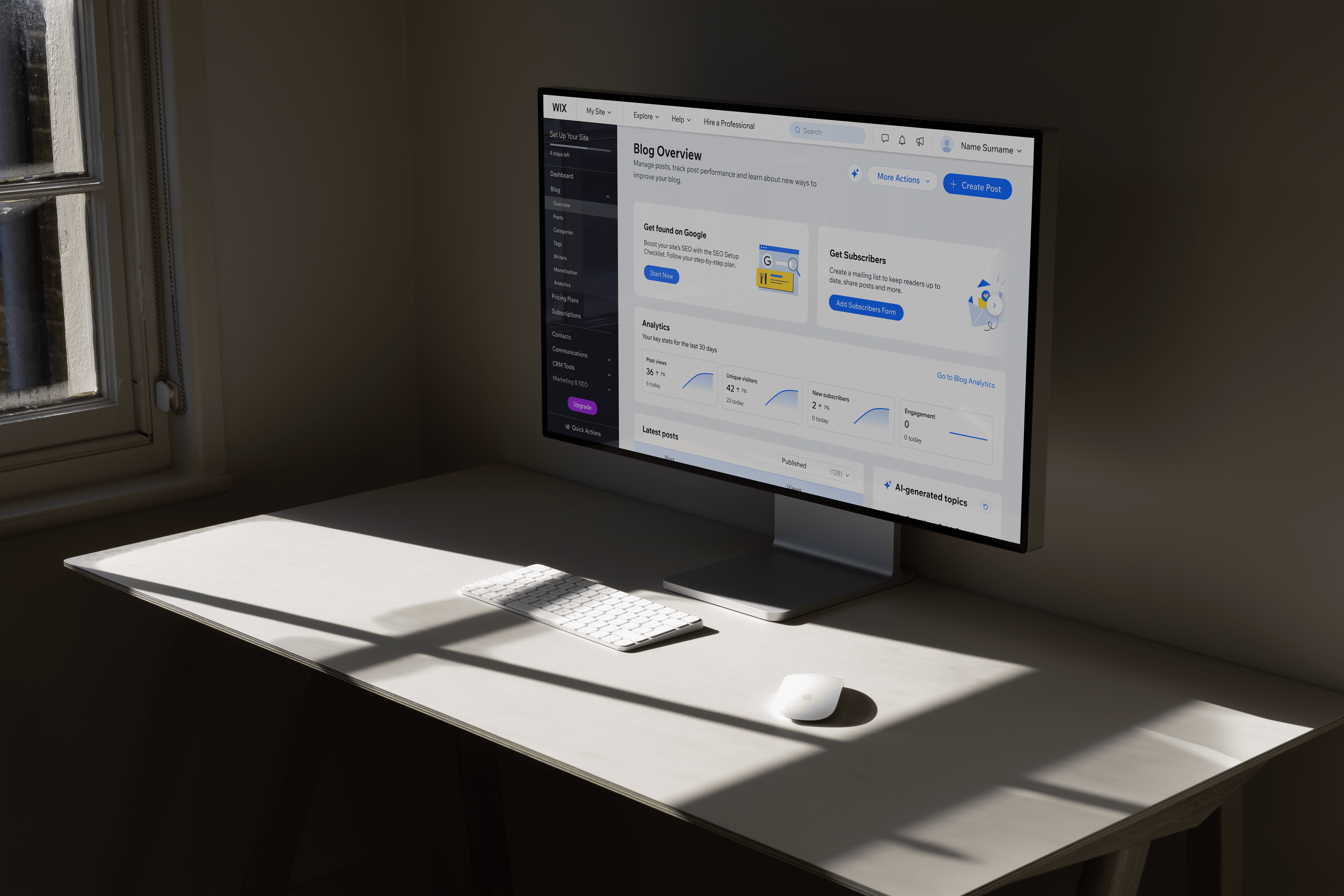
Blog overview
Post list
Categories list
Tags list
AI tools
Wix Blog is used by a wide range of creators, from people writing their first blog post to professional publishers. Over time, the dashboard became more powerful, but also harder to navigate within an already complex product.
Updated Blog Overview page
Dashboard before redesign
The dashboard had to work for very different users at the same time.
New bloggers needed guidance and clarity, while experienced creators cared more about speed, control, and data.
At the same time, we were updating older parts of the dashboard to a new design system, working within technical constraints, and introducing early AI tools that didn’t yet have clear design patterns across the company.

Dashboard before
Help users understand what’s happening with their blog and what to do next, with clear structure, learning content, and AI-generated post ideas based on their blog type.
Make it easier for experienced creators to manage, compare, and act on their content directly from the Overview page, without unnecessary steps.
What I aimed to achieve
Creating a clear starting point
Creators came to the dashboard with very different needs, and the existing overview tried to cover too much at once.
Working with a data analyst, I reviewed which sections of the Blog Overview were actually used and restructured the layout to surface the most relevant actions first.

Speeding up everyday content management
As blogs grow, creators spend most of their time managing existing posts. The post list was one of the most used areas, but key actions and information were spread across multiple screens, slowing down everyday workflows.
Post list - before vs after
Supporting creators without disrupting workflows
The dashboard needed to move to a new design system without changing how users already worked. We updated components step by step and kept AI optional.

Post details and statuses were visible directly in the list, reducing the need to open individual posts.
Making a complex dashboard feel manageable
Overview page - before vs after